The Harmony Behind My Logo: Why I Chose the Fifth Vibration Fraction
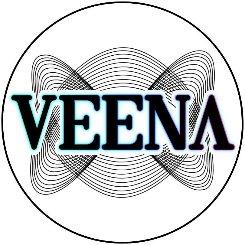
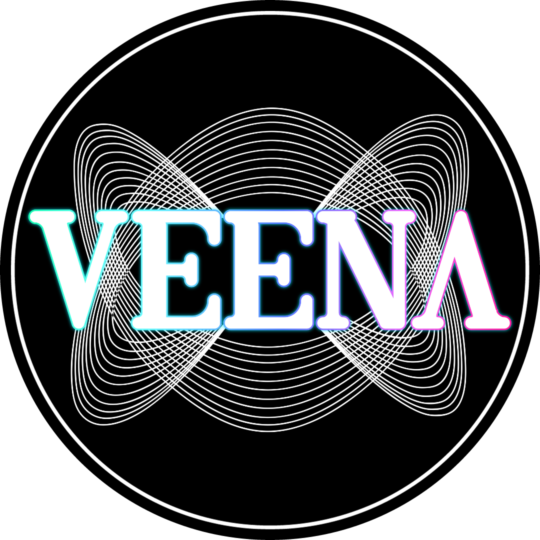
The design of the Veena Media logo is rooted in sound and intention. The swirling pattern is based on a perfect fifth, one of the most harmonious and universally pleasing musical intervals. I’ve always been fascinated by how sound can be visualized. How certain tones and frequencies naturally produce beautiful, balanced patterns. This shape represents harmony, creativity, and resonance —values central to everything I do with Veena Media, connecting my work to something ancient, mathematical, and profoundly human: how we experience beauty through sight and sound.
Perfect Fifth 3:2 Ratio
The symbol behind the Veena Media logo is known as a Lissajous figure, a shape created by combining two waves that move at different speeds. Here, the waves represent sound frequencies vibrating at a 3:2 ratio, which musicians refer to as the perfect fifth. When these two tones interact, they sound harmonious and create an appealing visual when transformed into motion. This symbol serves as a visual pattern that translates musical harmony into form.
To create this shape, a harmonograph is used, which uses swinging pendulums to create images of sound wave interactions. The version I selected is known as the Fifth Vibration Fraction because it visually represents the 3:2 frequency relationship.
This ratio has been in existence for centuries across various musical cultures. In sound, it creates one of the most consonant and resonant intervals we can hear. It has been utilized in sacred chants, classical compositions, jazz harmonies, and electronic music. There’s a reason it appears repeatedly: it resonates with the human spirit. The Greeks believed that harmony in music reflected harmony in the universe. That philosophy connects with me. I wanted that same sense of harmony to be visually embedded in my brand.
Lissajous Figure
What fascinates me most is how that harmony manifests visually. When a 3:2 frequency relationship is expressed in a visual format, whether through a harmonograph, an oscilloscope, or algorithmic design, it creates a looping, balanced Lissajous figure. These figures are generated by plotting two sine waves against each other at right angles. When the ratio is a simple one, such as 3:2, the resulting pattern is both elegant and symmetrical. The specific Lissajous figure is the fingerprint of sonic balance. It’s what happens when motion, math, and meaning converge.
What is the Fifth Vibration Fraction? When one tone vibrates three times for every two vibrations of another, you create a perfect fifth, a musical interval often regarded as one of the most stable, pleasing, and resonant sounds in existence. From Gregorian chants to modern EDM, the perfect fifth is everywhere. It’s mathematical. It’s ancient. It’s harmonic.
Visually, when you plot these frequencies together, especially with a harmonograph or oscilloscope, you create a Lissajous figure: a spiraling, looping, balanced pattern. That exact pattern is the foundation of my logo.
My logo is the visual language of sound. As someone who has spent years in audio engineering, this pattern serves as a metaphor for my approach to work. Just as sound waves blend to create harmony, I combine seemingly different disciplines, communication, music, visual art, data, and emotional, into a unified, whole message.
Music Theory to Design Language
In a way, I chose that figure to embed music theory into the design language. It serves as a visual mantra. Every time I see it, I’m reminded of the deep connections between sound and form, between chaos and order. It symbolizes how frequencies align, illustrating how two distinct signals can find harmony when they move at the right ratio. That’s the lens through which I view creativity, finding patterns where others see noise and creating resonance between ideas, platforms, and mediums.
By incorporating the Fifth Vibration Fraction into my logo, I make a subtle statement: my work is rooted in creativity and harmony. In the true, mathematical, and emotional essence of what harmony represents. It’s deliberate, symbolic, and spiritual.